Guest blogger David Sepkoski writes...

A sketch of the author with Hallucigenia.
For well over a century, the visual “language” used for narrating patterns in the history of life has settled on a few kinds of emblematic images [note 1]. The first is the classic genealogical “tree,” made famous especially in Darwin’s and Ernst Haeckel’s evolutionary studies:

Darwin’s “tree of life” from Origin of Species, 1859.
A tree is a good kind of diagram for showing phylogenetic or cladistic relationships, but evolutionary trees like this aren’t especially useful for conveying information about quantitative changes in phenomena like diversification or extinction—a tree simply records whether a lineage is present and when it ends, without telling much about what else is happening at the time.
A better kind of image for telling that sort of story is a line graph, which can “narrate” the kinds of patterns in data that give us an idea of what’s happening in the overall ebb and flow of the history of life. For example, this graph depicts changes in “faunal diversity” (i.e., the number of groups of animals of different kinds alive at any given moment) among marine invertebrates over the Phanerozoic eon:

“A Kinetic Model of Phanerozoic Taxonomic Diversity: III. Post-Paleozoic Families and Mass Extinctions” Paleobiology 10 (1984).
This particular graph was published by my father, Jack Sepkoski, in 1984. My dad built the first comprehensive electronic database for the fossil record, and this image is a good summary of the major finding of his data analysis: that life appears to have diversified in a “logistic” (s-shaped) pattern predicted by equations developed a century ago for population demography, but that this pattern has also been “perturbed” several times by major diversity drops—which we interpret to be mass extinctions. The good news, though, is that this visual story tells us that life always seems to recover quickly afterwards.
My dad used computers and fairly complex statistical analysis to generate his data narrative, but in fact paleontologists have been doing this kind of thing for a long time. In 1860, the English geologist John Phillips published the first diversity graph, based on an analysis of paper data collections:

John Phillips, Life on the Earth; Its Origin and Succession (Cambridge; London: Macmillan, 1860).
One thing you should notice is that it looks very similar, in broad outline, to the Sepkoski graph—although you need to mentally rotate the image and flip it so that it’s oriented left-to-right like Sepkoski’s diagram. The reason for this is that in the 19th century, the standard geological practice was to orient figures vertically, with time flowing up from the bottom, in the manner of a classic depiction of an idealized stratigraphic column like this one:

George Cuvier’s idealization of the stratigraphy of the Paris basin, from Ossemens Fossiles (Paris, 1812).
Line graphs obviously aren’t unique to paleontology—they’re used to represent changes in data in two dimensions that can stand for anything. The axes of a diversity graph happen to represent time and number of taxonomic groups present. Interestingly, line graphs like this weren’t used much in any context before the mid-19th century, when they suddenly took off as the standard idiom for depicting phenomena like economic growth or population changes. More on this later.
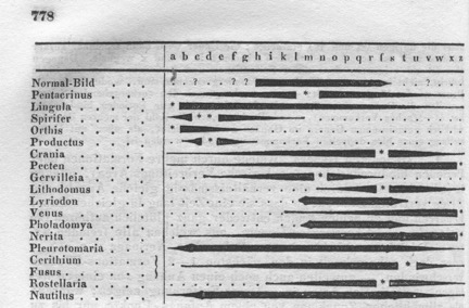
A third kind of diagram commonly used in paleontology is what’s called a “spindle diagram” (since it looks a little bit like the spindle of a loom):

J. John Sepkoski Jr., “A Factor Analytic Description of the Phanerozoic Marine Fossil Record,” Paleobiology 7 (1981).
This diagram was also published in the 1980s by my father, and it shows the pattern of diversification for each group of marine fossil invertebrates as the varying thickness of each spindle. It’s another way to use data to narrate the fossil record, and a particularly effective one for showing how particular groups’ histories correlate with one another. For example, in this diagram we can see that the trilobites (in the middle column) diversified rapidly early in the history of life, and then plummeted to sudden extinction, while the gastropods and bivalves rose to replace them as dominant marine lifeforms.
Spindles are also a fairly old visual idiom. They’ve been popular since the early 20th century, and are sometimes called “romerograms” after the vertebrate paleontologist Alfred Romer (1894-1973), who popularized their use. In fact, spindles go back much earlier in paleontology. They first appeared around the 1840s, in images like this one, from the German paleontologist Heinrich Georg Bronn’s 1849 Index Paleontologicus, a massive taxonomic data compilation and analysis of the entire fossil record:
H.G. Bronn, Index Palaeontologicus, Oder, Übersicht Der Bis Jetzt Bekannten Fossilen Organismen (Stuttgart: E. Schweizerbart, 1848).
Bronn (1800-1862) is a fascinating figure. At a time long before the development of computers—or even probabilistic statistics—he developed a “data-driven” approach to paleontology that involved making a census of the global fossil record (by scouring taxonomic catalogs and compendia), converting that information to numerical data, and analyzing those data for patterns. He expressed these patterns both as images like the spindle diagram above, as well as in complex numerical tables, like this one (also from his Index) showing the relationship between fossil (extinct) and living genera of plants and animals:

H.G. Bronn, Index Palaeontologicus, Oder, Übersicht Der Bis Jetzt Bekannten Fossilen Organismen (Stuttgart: E. Schweizerbart, 1848).
How Bronn came to this approach to the history of life—which was highly unusual for its day—is an interesting story. While at the time of his death in 1862 Bronn was considered one of the leading paleontologists in Europe, he wasn’t originally trained as a paleontologist or geologist. Rather, his background was in the science of “cameralism,” an 18th and early 19th century approach to rational state administration popular in central and northern Europe.
Cameralists were famous—and infamous—for collecting massive amounts of data about state populations, economic products, natural resources, and the like, and publishing them in mind-numbingly boring tables. The idea was that this data could tell them—and the kings and princes they worked for—something useful about how to maximize profit and resources, but cameralists developed a fairly deserved reputation for fetishizing data accumulation without having much idea of what to do with it.
Bronn, however, was a member of a more cutting-edge school of cameralism at the University of Heidelberg, where he received his degree and joined the faculty in the early 1820s. Heidelberg cameralists objected to this more limited ambition for state statistics, and instead promoted an approach they described as “statics,” in which statistical data collection was accompanied by analysis in an attempt to determine regularities or even empirical “laws.” Bronn taught this approach in courses on agriculture and forestry throughout his career.
At the same time, he developed an interest in geology and paleontology, which over the course of a decade went from being a sideline to the main focus of his research. After a fossil collecting trip to Italy and the Alps, Bronn became interested in a central problem that occupied European geologists: how to date the earth’s strata relative to one another.

William Smith, A Memoir to the Map and Delineation of the Strata of England and Wales, With Part of Scotland (London: John Cary, 1815).
The science of stratigraphy had been established more than a decade earlier thanks to the work of geologists like Cuvier and the English surveyor William Smith, whose famous geological map of England demonstrated that the earth’s distinctive layers are “universal”—that is, they appear in the same order and arrangement all over the globe. The strata themselves were identified on the basis of the composition of the rock (e.g., granite, sandstone, etc.) and the “characteristic” fossils found within (our friends the trilobites, for example, would only be found in rocks of a certain age). Stratigraphic dating was the primary goal of most paleontological data collection, especially for invertebrate fossils.
But nobody really knew how much time was represented in each stratum, let alone how old the strata were—after all, absolute dating wouldn’t be possible until radiometric techniques were developed a century later. So some geologists—like Charles Lyell—devised a strategy whereby at least a broad, relative sense of the age of strata could be gleaned if enough fossil data was collected, and if the ratios or proportions in the longevities of species could be calculated.
That was the theory, anyway. In practice, it was much messier to work out these relationships, and Lyell eventually gave up. But Bronn—no doubt thanks to his background in cameralism and statistics—thought that this approach represented a new kind of natural history, where quantitative analysis of data could answer questions that mere qualitative observation could not.

A data table from H.G. Bronn, Bronn, Italiens Tertiär-Gebilde Und Deren Organische Einschlüsse: Vier Abhandlungen (Heidelberg: Groos, 1831).
So he attacked the problem like a good cameralist, and in 1831 published a book on the Italian Tertiary formations he had visited on his trip, along with extensive analysis of data culled from every fossil catalog and index he could find. He began with the premise that “the relationship of one Tertiary basin with another can be expressed mathematically, if one could assume to know every fossil species in the area well,” and concluded that his results initiated a new kind of paleontology—one he called “paleontological statics” [note 2].
Bronn pursued that approach for the rest of his career, systematically gathering ever larger data sets and performing more exhaustive statistical analysis. He also began experimenting with new pictorial ways of representing the patterns he discovered in the data: after all, a numerical table isn’t the most user-friendly device for representing historical narrative. In 1837, in an enormous compilation of stratigraphic taxonomy called Lethaea Geognostica, Bronn produced his first data image:

H.G. Bronn, XLVII Tafeln mit Abbildungen zure Lethäa Geognostica (Stuttgart: E. Schweizerbart, 1837).
The image above is the first known published spindle diagram in natural history. It is oriented vertically, like the stratigraphic column, and indeed the left-hand side of the diagram is an idealized table of the strata. Corresponding to this table, on the right, is a vertical spindle diagram showing the range and (very approximate) diversity of major groups of plants and animals. The reader can, then, absorb information about the history of various forms of life—their origin and extinction, as well as relative diversity in different geological periods—“at a glance.” Following the publication of this diagram, other geologists—like Agassiz—began publishing their own spindles, and Bronn himself continued to use the device in his subsequent statistical and theoretical work. An idiom was established in paleontology.
But Bronn’s cameralist background was not the source of this “visual language” he helped to develop. In cameralistic publications the table was the dominant visual device; narrative visual representations projecting data in visual space were not part of statistical visual culture. In fact, prior to the 1860s, visual representations statistics were hardly found anywhere—our current assumption that time and data can be represented as dimensions in measured graphical space had not yet achieved widespread cultural currency.
Except for in one apparently unrelated application, that is: since the mid-1700s, historians had taken to representing the lifespans of famous people and even civilizations as a “timeline,” like the one below, a genre-setting example published by Joseph Priestley in 1764.

Joseph Priestley, A Description of a Chart of Biography (London: J. Johnson, 1764).
Priestley’s method—which seems fantastically simple today—was to depict the lives of famous artists, philosophers, and scientists as vertical lines, so that one could see “at a glance” who was flourishing and when. Two decades later, he expanded this approach considerably with a chart showing the relative extent of the great empires of the world:

Joseph Priestley, A Description of a New Chart of History (1786).
In this chart, empires are not represented by single lines, but rather a second dimension has been introduced: the geographical extent (analogous to size or power) of each empire is on the vertical axis. As Priestley put it in his description, “If the reader carries his eye vertically, he will see the contemporary state of all the empires subsisting in the world, at any particular time. He may observe, which were then rising, which were flourishing, and which were upon the decline.”
This image—which became widely popular and was much reproduced, imitated, and pirated during the 19th century—is effectively a spindle diagram for world empires. It (or an imitator) is likely the inspiration for the particular visual form Bronn adopted for his statistical narratives, since it was the only visual idiom for representing change over time that had wide currency in the 1830s and 1840s. Over the next decades, the notion that time could be analogized to visual space became more widely accepted in the natural and social sciences, and a greater diversity of statistical graphics (like line graphs) appeared in many fields. But this analogy had to be learned—it wasn’t innately intuitive—and it took people like Bronn experimenting with methods and devices from distinct disciplines, like geology, cameralism, and historiography, to help its spread.
Some people will be interested to learn that Bronn apparently invented spindle diagrams, but I think the larger message is that nothing is so obvious or self-evident—not even that a line travelling from left to right traces change over time—that history can’t tell a surprising story about its origin. So the next time you look at a diversity graph—or a stock market projection, or a Google n-gram—you can give a little nod to Bronn—and Joseph Priestley and many other early statistical innovators—for having a hand in something we all now take for granted.
NOTES:
- I use the term “visual language” following Martin Rudwick’s classic 1976 paper “The Emergence of a Visual Language for Geological Science 1760—1840." Recently, Sachiko Kasukawa has reassessed (positively) the importance of this article, which is really worth a read if you don’t know it!
- Heinrich Georg Bronn, Italiens Tertiär-Gebilde Und Deren Organische Einschlüsse: Vier Abhandlungen (Heidelberg: Groos, 1831), 175 and 74.
SUGGESTIONS FOR FURTHER READING:
Theodore W. Pietsch, Trees of Life: A Visual History of Evolution (Baltimore: The Johns Hopkins University Press, 2013).
Daniel Rosenberg and Anthony Grafton, Cartographies of Time: A History of the Timeline (Princeton, NJ: Princeton Architectural Press, 2010).
Martin J. S. Rudwick, "The Emergence of a Visual Language for Geological Science, 1760-1840," History of Science, 1967, 14, no. 3:149-95.
---- Earth’s Deep History, How It Was Discovered and Why It Matters (Chicago: The University of Chicago Press, 2014).
David Sepkoski, "Towards ‘‘a Natural History of Data’’: Evolving Practices and Epistemologies of Data in Paleontology, 1800–2000," Journal of the History of Biology, 2013, 46, no. 3:401-44.
---- “The Earth as Archive: Contingency, Narrative, and the History of Life,” in Lorraine Daston, ed., Science in the Archives: Pasts, Presents, Futures (Chicago: University of Chicago Press, 2017), 53-83.
BIO:
David Sepkoski is a Senior Research Scholar at the Max Planck Institute for the History of Science. Most of his recent work has been on the history of paleontology, extinction, and evolution. His latest book, Rereading the Fossil Record: The Growth of Paleobiology as an Evolutionary Discipline (Chicago 2012), is a study of the development of theoretical paleontology over the 20th century.* He is currently finishing a book on the scientific and cultural history of extinction, titled Catastrophic Thinking: Extinction and the Value of Diversity.
*For all those last-minute holiday shoppers, please note that Rereading the Fossil Record is recently available in paperback! A perfect gift for that hard-to-buy-for paleontologist in your life. Whether that's you or someone else.